
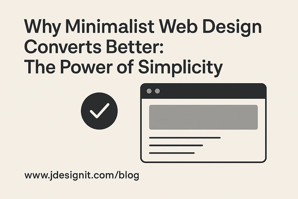
Why Minimalist Web Design Converts Better: The Power of Simplicity
- Jay Chua
- Feb 27, 2025
- 2 min read

Updated: Aug 13, 2025
Cut the clutter, boost engagement, and design smarter—here’s why “less is more” wins online.
🚀 Why Minimalist Web Design Works
In a world drowning in digital noise, users crave clarity. Minimalist web design strips away distractions, guiding attention to what truly matters. It’s not just about aesthetics—it’s about performance, usability, and emotional impact.
🔍 SEO-Optimized Benefits of Minimalist Design
Here’s why minimalism isn’t just trendy—it’s strategic. This table breaks down the top advantages in a clear, emoji-rich format:
#️⃣ | 💡 Benefit | 📈 Impact |
1️⃣ | 🧭 Better Usability | Clean layouts improve navigation and boost user satisfaction by 83% |
2️⃣ | ⚡ Faster Load Times | Minimal pages load 40% quicker, reducing bounce rates and boosting SEO |
3️⃣ | 🎯 Higher Conversion Rates | Just 1-second delay = 7% drop in conversions—speed matters |
4️⃣ | 🔍 Improved Search Rankings | Google favors fast, uncluttered sites with clear structure |
5️⃣ | 👁️ Stronger Visual Impact | White space highlights key content, making messages more memorable |
6️⃣ | ❤️ Emotional Connection | Focused design builds trust and brand loyalty |
7️⃣ | 📱 Mobile-Friendly Experience | Simplicity ensures smooth performance across all devices |
8️⃣ | 🧪 Easier A/B Testing | Fewer elements = faster insights and design optimization |
9️⃣ | 🧼 Cleaner Branding | Minimalism reinforces brand identity with clarity and consistency |
🔟 | 📊 Higher Engagement | Users stay longer and interact more with streamlined interfaces |
🌟 Real-World Examples That Nail Minimalism
Apple: Sleek product pages, bold whitespace, intuitive flow—no fluff.
Airbnb: Emotional imagery + simple navigation = 120% booking boost.
Dropbox: Focused functionality led to a 60% spike in sign-ups.
🛠️ How to Design Minimalist Websites That Convert
Want to apply minimalism to your next project? Start here:
🎯 Prioritize Content: Focus on what users need most.
🤍 Use Whitespace Wisely: Let your design breathe.
🎨 Stick to 2–3 Colors: Keep it clean and brand-aligned.
🔠 Limit Fonts: Two is plenty—clarity over chaos.
🧩 Trim the Fat: Every element should have a purpose.
👀 Test with Real Users: Validate your design choices.
💬 Final Thought: Why “Less Is More” Still Wins
Minimalist web design isn’t just a style—it’s a strategy. It’s how brands like Apple and Airbnb build trust, drive action, and stay memorable. In a fast-paced digital world, simplicity isn’t a compromise—it’s a competitive edge.
Want your site to stand out, load faster, and convert better? Strip it down. Focus up. Design smart.


Comments